I found an interesting forum post over at SQLTeam this morning, and decided to have a go at coming up with a solution.
Filters are quite commonly used in Tablix reports to show only the top n rows from a dataset. This is easily done by using the Top N operator in the Filters tab of the Tablix, and choosing the column in the Expression drop down.
In the forum post however, the original poster was wanting to show the top n values in a chart. The chart would by default sum up the values in the data field. The trick would be to get the top n aggregated values, as opposed to taking the top n original values and then doing the aggregation. To start with, I created the following very simple table and data.
create table EmployeeSales
(
EmployeeName varchar(20),
SalesAmount money
);
go

insert into EmployeeSales
(EmployeeName, SalesAmount)
values
('Jerry', 9.99),
('Jerry', 30.00),
('Jerry', 55.70),
('Jerry', 4.99),
('George', 3.99),
('George', 1.99),
('George', 1.99),
('George', 1.99),
('George', 15.00),
('Kramer', 17.00),
('Kramer', 152.00),
('Kramer', 99.99),
('Kramer', 75.00),
('Elaine', 9.99),
('Elaine', 15.99),
('Elaine', 3.99),
('Newman', 120.00),
('Newman', 5.99),
('Newman', 5.99),
('Newman', 0.99)
;
I then created a report in SSRS 2008 with a DataSet called Sales, which contained the following SQL query.
select EmployeeName, SalesAmount
from EmployeeSales
I dropped a Tablix onto the report, and set the source to be the Sales dataset, with two columns for the fields in the dataset. At this point I also created two Parameters, @TopSalesN and @TopTotalSalesN, both integers with a default value of 5. I then went to the Filters tab in the Tablix Properties and added a filter with the following values (see picture)…
Expression: [SalesAmount]
Operator: Top N
Value: [@TopSalesN]
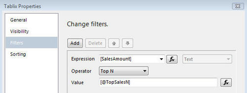
Then in the Sorting tab, I sorted the data by [SalesAmount], order Z to A.
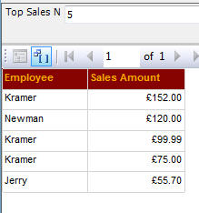
Running a preview confirmed this worked as expected and I could change the parameter to show as many values as I needed.
Then I added a standard column chart next to the tablix. I dropped the SalesAmount column on the data fields section, and EmployeeName onto the category fields section. There is no filter option on the Series properties for the data, so I tried to add a filter on the Chart Properties. I found two issues with this. Firstly, if you try to use an aggregate value in the filter Expression then the report fails to process, as this is not allowed. If you filter on the raw values, then obviously all you do is remove rows from the raw data and the results are not what you expect.
To produce the correct results, the filtering (and sorting, if required) needs to be added to the Category Group Properties on the Category Field. I set it up as follows…
Expression: [Sum(SalesAmount)]
Operator: Top N
Value: [@TopTotalSalesN]
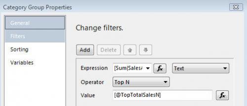
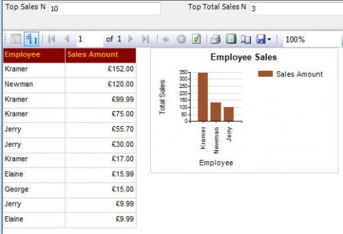
This gave me exactly what I was looking for. The image shows the preview of the report, with the top 10 rows from the raw dataset in the tablix, and the top 3 Sales by Employee in the chart.
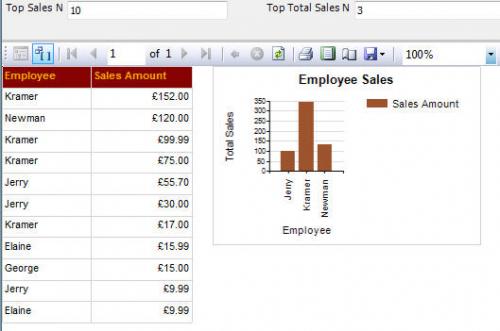
The original poster also wanted the chart data to be sorted. This is easily done by adding a sort on the Category Group Properties, sorting by [Sum(SalesAmount)] Z to A. The final image shows how this looks.
I can see quite a few situations where using this method of having one “raw” dataset and more than one report item consuming the data in different ways would be very beneficial. Particularly in cases where you have a data report and you need to show a summary chart relating to the data on the same report.
Another method you can use for “Top N” reports is to pass a TopN parameter into a stored procedure, and use that value in the SQL statement. For example…
create procedure [dbo].[TopSales]
@TopN tinyint = 20
as
set nocount on;

select top (@TopN)
EmployeeName,
SalesAmount
from EmployeeSales
order by SalesAmount desc

exec dbo.TopSales 10